So you’ve started building dashboards with Dash Plotly. Bravo! But you soon realize that even if it is easy to build dashboards, it is somehow not easy to make them look good. So how do you design a beautiful dashboard with Dash?
In this tutorial, I’ll give you tips and advices to keep in mind to create visually appealing dashboards and Dash apps, to increase the usability and aesthetics of your project.
Introduction
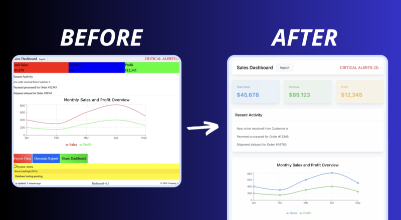
Let’s be honest: most dashboards are functional but completely fail in terms of UI/UX (user interface/user experience). And that’s normal—most of us are data analysts, data scientists, or Python developers, and UI/UX is not our job.
If you are building a dashboard for your own use or designed for technical people, you might not care about aesthetics. But if you want people outside your team to engage with and use the amazing dashboard that you made, you should invest time in making your dashboard visually appealing.
This is even more true if you are creating an app used by non-technical people (not in your field) or if you are developing a SaaS product for a broader audience with Dash.
Fortunately, by following a few rules, you can significantly improve your skills in building beautiful dashboards and apps. Let’s dive in. 🙂
Pick a font
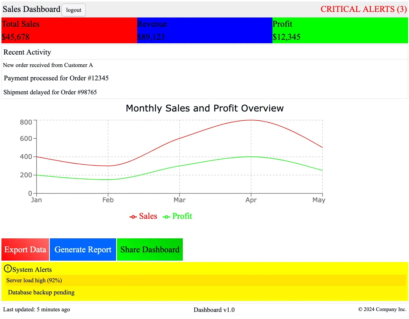
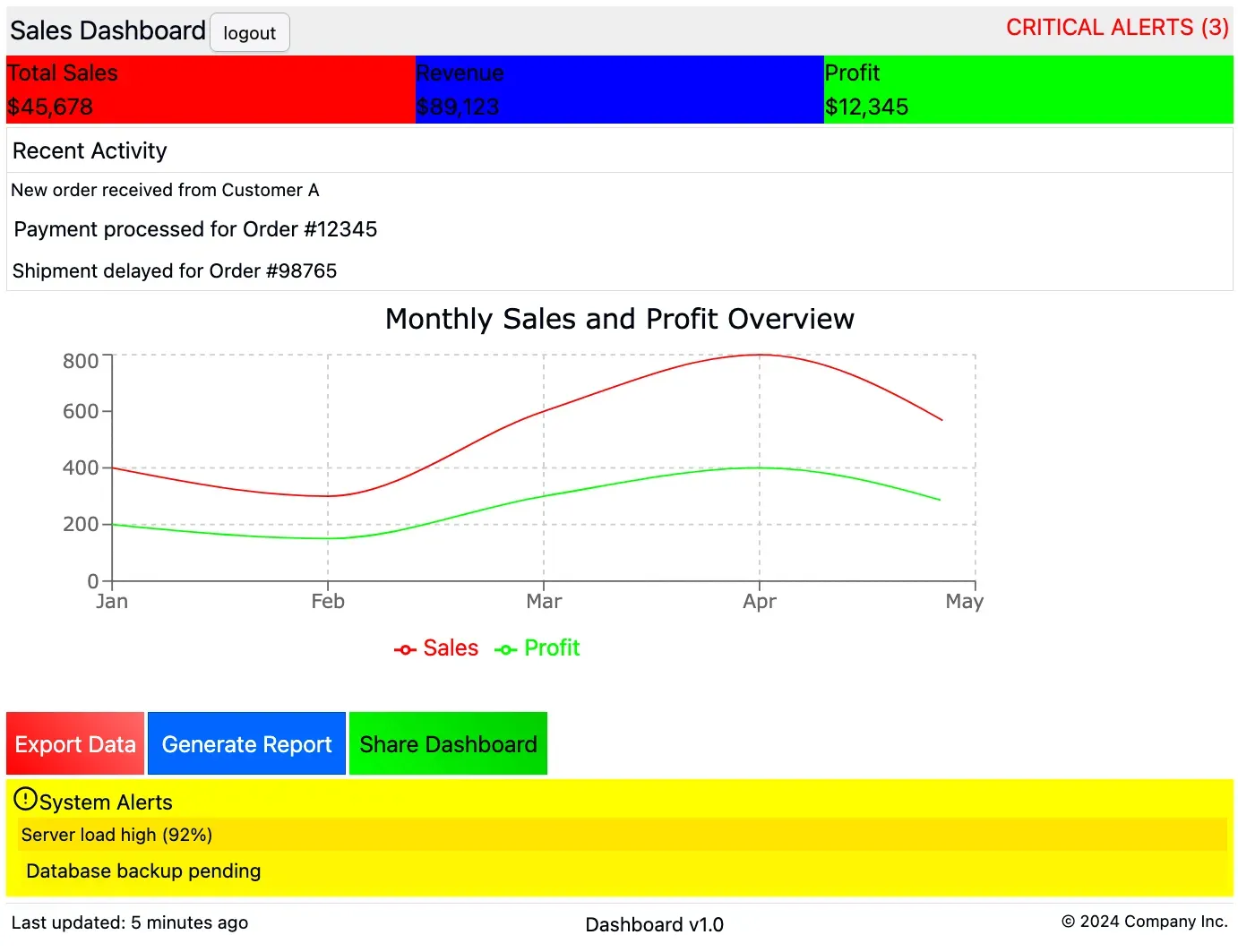
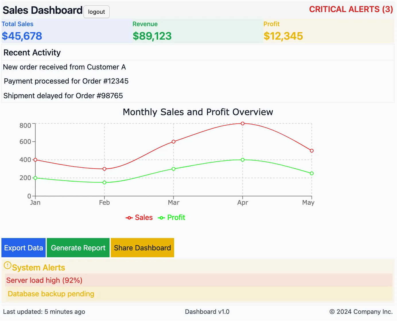
The harsh truth: the lack of a personalized font is one of the common traits of ugly dashboards. That’s why I put it at the top of this list. You’ll never see a professional-looking app that sticks to “Times New Roman” (i.e., the default font in most web browsers).
This doesn’t mean this font should never be used, but it means that default fonts quickly show that no effort was put into aesthetics. So, setting a proper font is a real quick win.
Serif fonts often imply tradition and formality (Times New Roman is widely used in newspapers and books, and there’s nothing wrong with that if your app is focused on reports, articles, or anything content-heavy). But usually, dashboards benefit from sans-serif fonts for a cleaner, more modern look.
Recommended fonts are the basic ones:
- Arial, Open Sans, Verdana, Helvetica Neue.
If you need more stylish and trendy fonts, here are some great options:
- Roboto (modern and widely used in web design)
- Lato (clean and friendly, great for dashboards)
- Montserrat (sleek and professional)
- Inter (highly readable and trendy for UI design)
If you need more inspiration, you can explore Google Fonts or Adobe Fonts to find stylish options that fit your dashboard’s aesthetic. But being too exotic is not a good idea either.
Note: You should always set a font because otherwise, your app might look different on various devices (Windows, Mac, Linux, etc.) and browsers, which may pick different default fonts.
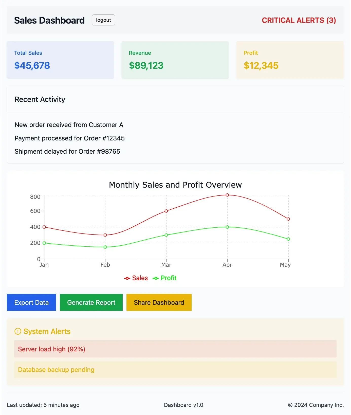
Pick colors correctly
No colors is terrible
Colors help with contrast, and contrast is absolutely necessary if you want to ease the eye. A dashboard with no contrast is hard to read, making users tire quickly. If everything looks the same, users won’t know where to focus.
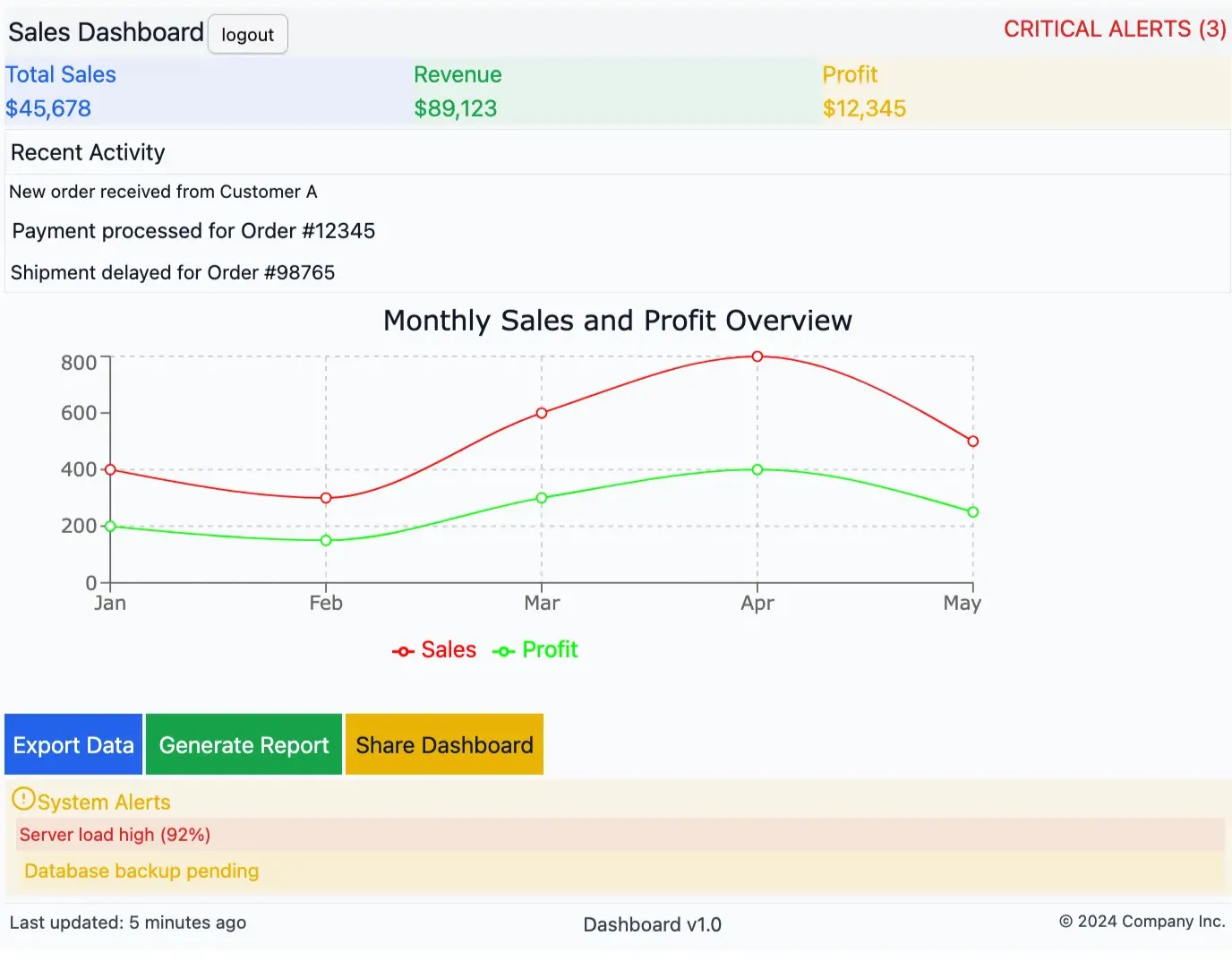
Using just black and white or a single muted color can make your app look dull and unstructured. Instead, introduce some contrast using different shades and tones, but in a subtle way. Use colors to differentiate sections, highlight key metrics, and guide user attention effortlessly.
Too many colors is terrible
On the flip side, throwing in too many colors makes everything look chaotic. Too much contrast can make your dashboard overwhelming and confusing. A rainbow-colored dashboard is not visually appealing—it’s distracting.
Go easy on gradients. Too many gradients will make your app look like outdated WordArt! Use soft gradients sparingly—to highlight a few buttons or text, but not everywhere. Stick to a defined color palette and ensure your colors complement each other.
Importance of color choice
Colors enhance the appearance of your app but also improve user experience: you can emphasize the importance of a button by its color alone, meaning the user instantly understands its significance.
People also associate certain colors with specific actions—red buttons usually indicate critical actions, while blue or black buttons tend to be more neutral. Green often signals success, and yellow can be used for warnings.
Just like fonts, using default colors (100% red, 100% green, or 100% blue) will make your dashboard look unpolished. Instead, pick variants of these colors—softer shades, deeper tones, or slight variations.
Pro tip: If you don’t know what colors to use, you can rely on predefined color palettes from Mantine, Bootstrap, or websites like Flat UI Colors.
Also remember that users have different visual impairments (e.g., color blindness). Learn more about it here: coloring for colorblindness.
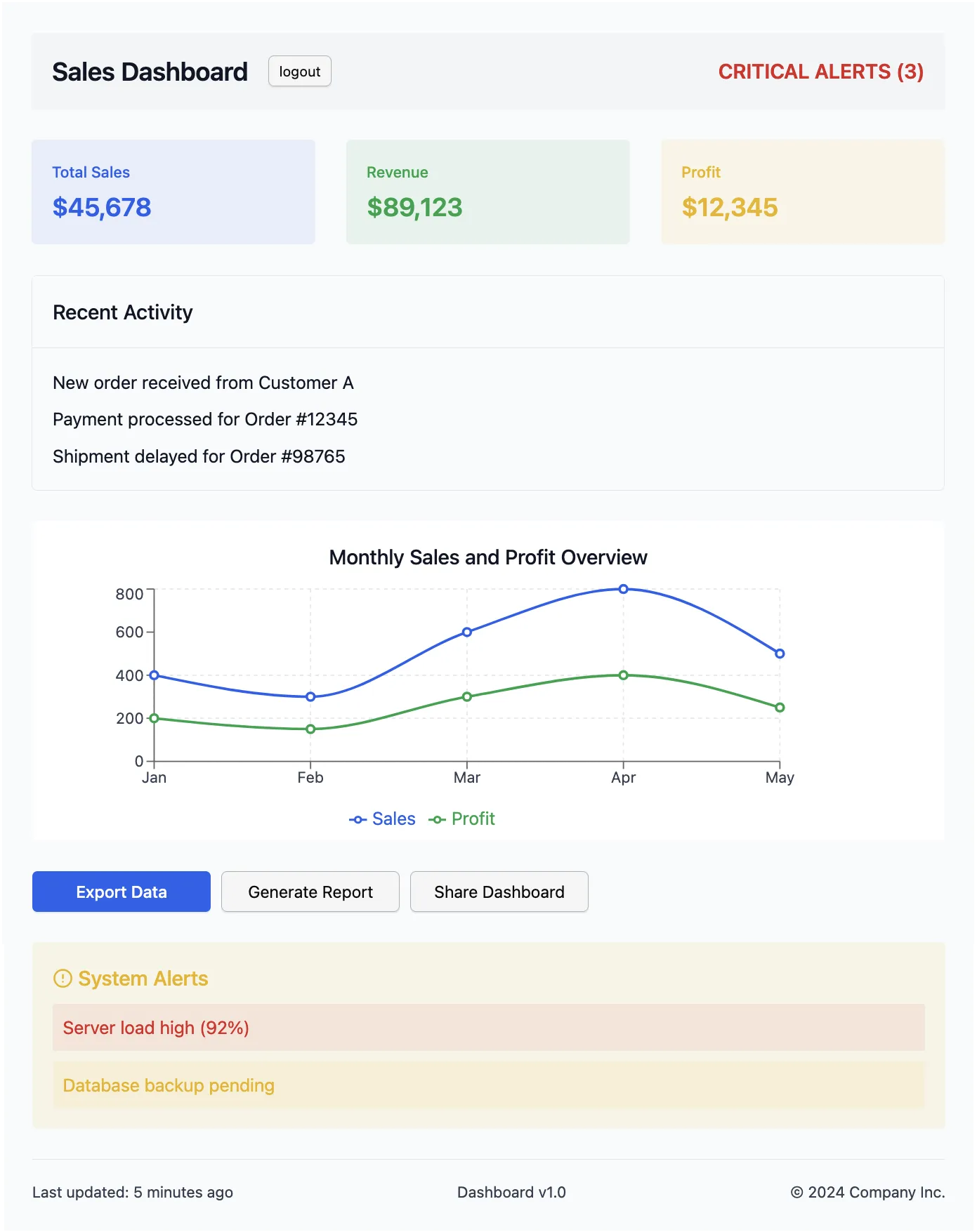
Beware of the hierarchy
Hierarchy isn’t just about making titles bigger —it’s about creating a natural flow for the eyes. When someone looks at your dashboard, they should naturally understand what’s important and what’s secondary.
A simple but effective approach is to stick to 3-4 text sizes for your entire app. Your main title should be the biggest (around 32px), followed by section titles (24px), and then your regular text (14-16px). Don’t go smaller than 12px – nobody likes squinting at tiny text!
But size isn’t everything. You can also create hierarchy through weight (bold vs regular) and color intensity. Just like in a newspaper, the most important stuff should catch your eye first.
Think about it: when you look at a well-designed website, you instantly know where to focus, right? That’s good hierarchy at work.
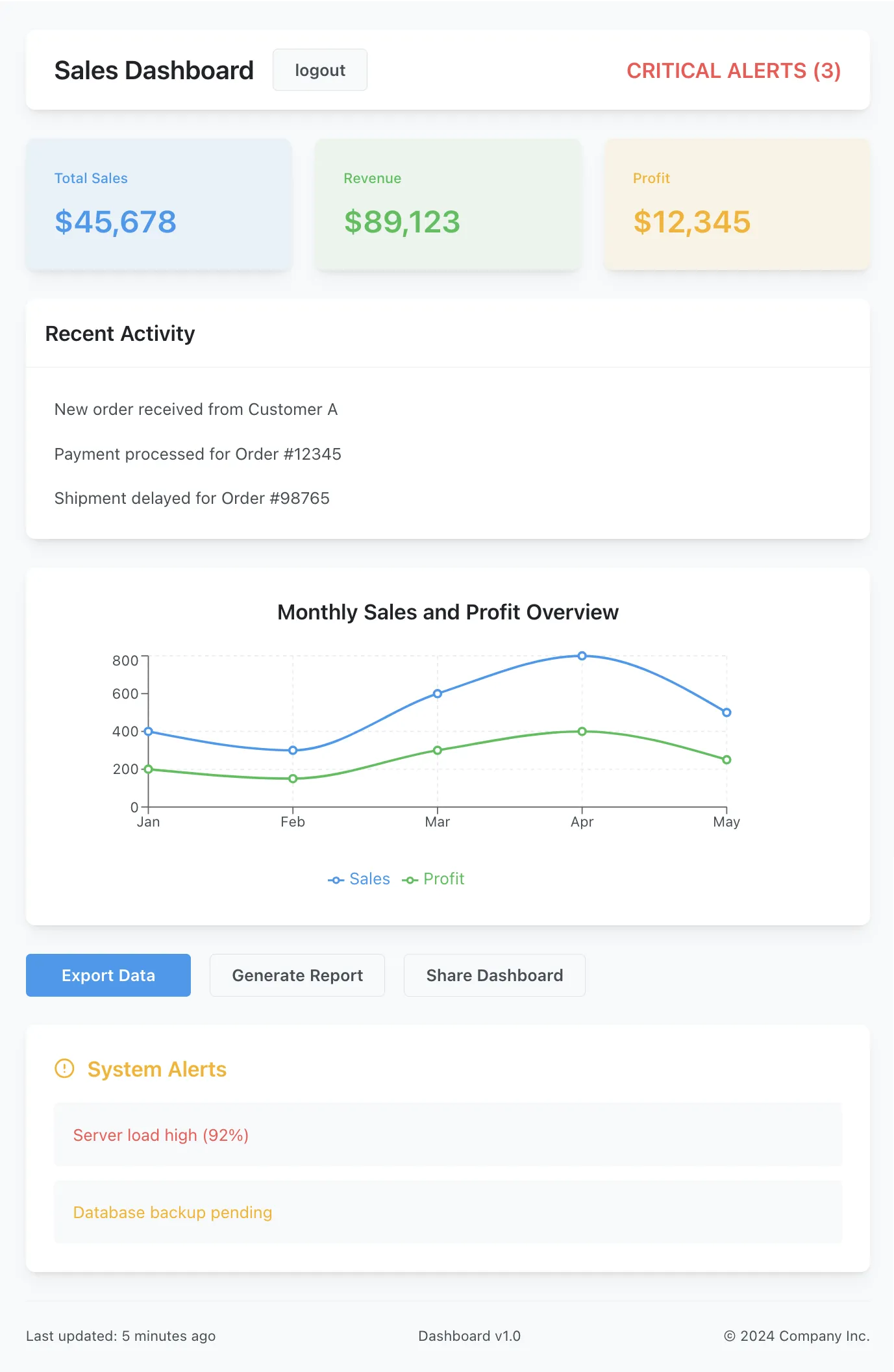
Space things out!
Let your components breathe:
- Add margins around text and padding inside buttons.
- Text should not be stuck to the border of its container—use proper padding and margins.
The easiest way to handle spacing is to pick a basic unit (like 8 pixels) and use multiples of it. Put a little space between related items (8px), more space between different elements (16px), and even more space between major sections (24px or 32px).

Remember: white space isn’t wasted space. It’s like the margins in a book – without them, everything would be a mess and hard to read. Give your components some breathing room. Your users’ eyes will thank you.
Keep things homogeneous
In art, proportions are an integral part of the works of the greatest masters. Many sculptures and paintings, for example, use the golden ratio.
The same applies to interfaces: consistency is key to making dashboards look polished and professional.
But what does this mean in practice?
- Apply the same margins and padding throughout, ensuring a balanced layout while respecting hierarchy.
- Stick to 2-3 main colors with one accent color for emphasis. Example: if you use blue buttons, don’t randomly switch to green unless it serves a purpose.
- Keep shapes and styles uniform—rounded buttons should stay rounded, and shadows should be consistent across cards.
Small details make a big difference!
Remember to style charts too
By default, Plotly charts do not inherit the styles of your app. So, be sure to at least set the font style and colors to match your dashboard.
Also, tweak chart elements like gridlines, legend placement, and axis labels to keep the same spacing you used before (to keep things homogeneous!).
Another pro tip: If your dashboard has multiple charts, keep them consistent in terms of styling. Same font, same color scheme, same layout rules—it all helps with clarity and makes your dashboard look like a professionally designed tool.
Use pre-made components
Last but not least: you should use component libraries like Dash Bootstrap Components (DBC) or Dash Mantine Components (DMC). These libraries come with a lot of default CSS rules and choices, a technic known as a CSS reset.
These rules ensure that HTML elements are correctly placed, well-spaced, have the right font sizes, and maintain a consistent, homogeneous style. Exactly everything we did before, so it will make you gain time.
However, these component libraries are popular which is a good and a bad thing:
- The good: people like them. Remember, users don’t want anything too crazy—they prefer familiar, intuitive designs. They will like your design because they are used to it.
- The bad: all websites look the same. However, with the choices you have (layout, colors, fonts, etc.), you can still make your dashboard unique while keeping it aesthetically pleasant.
My 2 cents: I always use at least DBC or Mantine in my Dash projects, whether I create custom components or not, because they bring a CSS reset and a lot of CSS utils.
See also:
Conclusion
Let’s wrap this up with an important reminder: these aren’t strict commandments set in stone. Think of them more as helpful guidelines that, when mixed and matched thoughtfully, can lead to visually appealing dashboards. You don’t need to follow every single rule.
The best way to improve your design skills is to experiment and stay observant. Pay attention to the apps and tools you enjoy using. What makes them pleasant to work with? How do they handle fonts, colors, and spacing? Take inspiration from what works well in your favorite applications.
And here’s a final thought: people tend to find “normal” things beautiful.
- You don’t need to reinvent the wheel or create the most unique dashboard ever seen. Aim for clean, familiar, and professional rather than wildly original.
- A “dash” 🙃 of creativity is great, but remember that if your dashboard looks too exotic, it might end up being harder to use!
The goal is simply to create something that looks professional and is pleasant to use.
Follow these guidelines, trust your eye, and you’ll be well on your way to creating dashboards that both you and your users will enjoy.
I hope you liked this guide and learn. This is part of my Dash plotly Course, be sure to check it out if you want to learn more about building dashboards.
If you have any question, join us on the dedicated topic on Plotly’s forum: here.