Are you working with excel/CSV data and looking to display it in your Dash application? This comprehensive guide will walk you through all the available options for creating tables in Dash, from the simplest to the most advanced solutions.
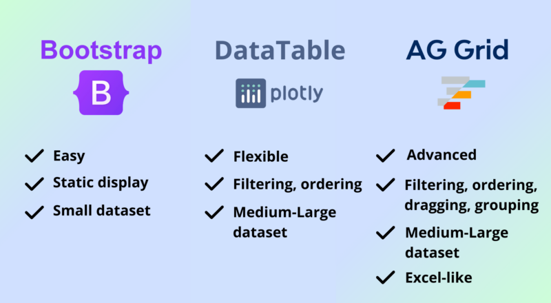
There are three main approaches to display tables, each with its own strengths:
dbc.Table.from_dataframe: A simple, static table from Dash Bootstrap Components.dash_table.DataTable: The built-in interactive table component by Plotly.dash-ag-grid: A powerful wrapper around AG Grid for advanced functionality.
Let’s dive in!
1. Quick Start: The Bootstrap Table Approach
The simplest way to display a DataFrame as a table is by using Dash Bootstrap Components‘ Table.from_dataframe function. It offers a clean, professional appearance with responsive design and basic styling options like striped rows, borders, and hover effects.
It requires to install the community package:
pip install dash-bootstrap-componentsHere is a an example code loading the titanic dataset and displaying it:
import dash
from dash import html
import dash_bootstrap_components as dbc
import pandas as pd

# Load Titanic dataset and select subset of columns for clarity
url = "https://raw.githubusercontent.com/datasciencedojo/datasets/master/titanic.csv"
df = pd.read_csv(url)
df = df[['PassengerId', 'Survived', 'Pclass', 'Name', 'Sex', 'Age', 'Fare']]

# Modify columns for better readability
df['Survived'] = df['Survived'].map({0: '❌', 1: '✅'})
df['Fare'] = df['Fare'].map(lambda x: f"${x:.2f}")

# Create the Dash app
app = dash.Dash(__name__, external_stylesheets=[dbc.themes.BOOTSTRAP])

# Generate the table using dbc.Table.from_dataframe
table = dbc.Table.from_dataframe(
    df,
    # Key styling options:
    striped=True,
    bordered=True,
    hover=True,
)

# Define the app layout
app.layout = html.Div([table])

if __name__ == '__main__':
    app.run_server(debug=True)
Try it below (or click here):
As you can see, we get a pretty decent table for consulting data. But Bootstrap tables are static: you cannot filter rows or sort column values. Other advanced features like pagination or cell editing (that come built-in with DataTable or AG Grid) are nonexistent, and implementing these would require significant development effort.
However, the Bootstrap table makes it easy to embed any Dash element inside each cell, giving you complete control over the content (e.g. adding a button or link or image in a cell is as simple as for anywhere in your dash app layout).
Note: under the hood, dbc.Table.from_dataframe is just building a table as we could do we html.Table, html.Tr, html.Td. It’s just an easier way to produce the tanle from a DataFrame plus having a good styling by default.
Styling with dbc.Table
It is easy to use CSS to style Dash Bootstrap tables. It is also possible to modify the table created to add styles to each cell, or each row.
# Modify the 'Survived' cells to apply conditional styling
for i, tr in enumerate(table.children[1].children):  # Iterate over rows (tbody > tr)
    for td in tr.children:  # Iterate over cells (td)
        if df.iloc[i]['Survived'] == '❌':
            td.style = {'color': 'red'}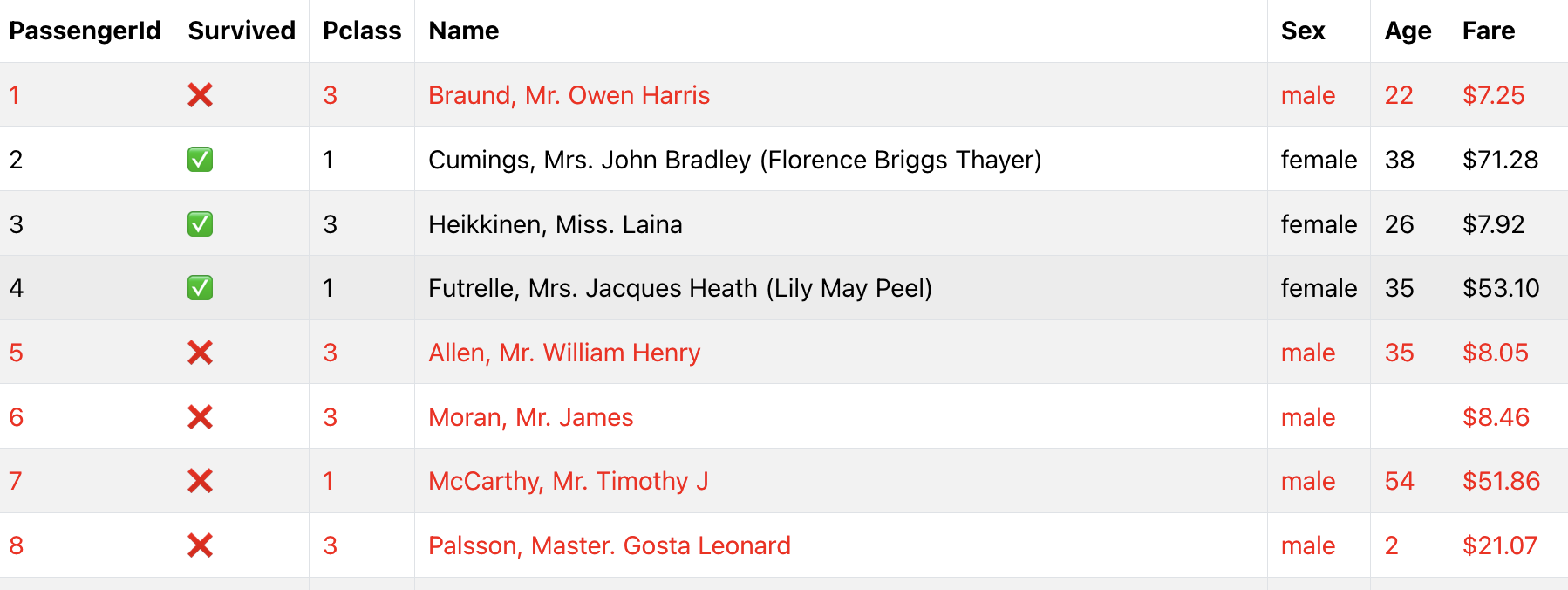
This way, we can easily implement our own styling rules on the generated table, without having to know extensive parameters (which you’ll see, is not the case for DataTable and AG Grid).
Why choose Bootstrap Table?
You should start with a Dash Bootstrap table when your data does not require filtering or sorting features, and if you plan to display a small dataset (i.e. < 100 rows).
It’s also maybe the easiest choice if you plan to mix the table content with other Dash components (checkboxes, dropdowns, buttons, etc.).
2. Interactive Tables with Dash DataTable
When you need interactivity, Dash’s built-in DataTable provides an excellent middle ground.
It comes included with the dash package and offers many features that work out-of-the-box, including editing cells, sorting, filtering, pagination, and column resizing.
from dash import Dash, dash_table
import pandas as pd
app = Dash(__name__)
# Load Titanic dataset and select subset of columns for clarity
url = "https://raw.githubusercontent.com/datasciencedojo/datasets/master/titanic.csv"
df = pd.read_csv(url)
df = df[['PassengerId', 'Survived', 'Pclass', 'Name', 'Sex', 'Age', 'Fare']]
# Modify columns for better readability
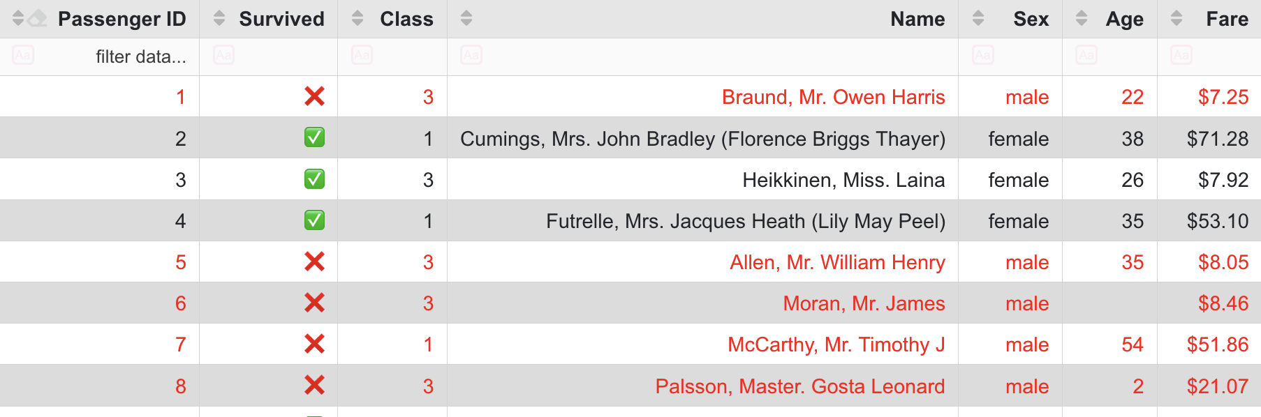
# Notice that Fare is formatted inside the DataTable component
df['Survived'] = df['Survived'].map({0: '❌', 1: '✅'})
# Create the DataTable
app.layout = dash_table.DataTable(
data=df.to_dict('records'),
# Note: columns parameter is mandatory
columns=[
{'name': 'Passenger ID', 'id': 'PassengerId', 'type': 'numeric', 'selectable': True, 'clearable': True, 'editable': True},
{'name': 'Survived', 'id': 'Survived', 'type': 'numeric'},
{'name': 'Class', 'id': 'Pclass', 'type': 'numeric'},
{'name': 'Name', 'id': 'Name', 'type': 'text'},
{'name': 'Sex', 'id': 'Sex', 'type': 'text'},
{'name': 'Age', 'id': 'Age', 'type': 'numeric'},
{'name': 'Fare', 'id': 'Fare', 'type': 'numeric', 'format': {'specifier': '$.2f'}},
],
# Enable key features
editable=True,
sort_action='native',
filter_action='native',
row_selectable="multi",
row_deletable=True,
page_size=15,
# Additional styling
style_cell={
'fontFamily': 'Arial',
'padding': '5px 10px'
},
style_header={
'backgroundColor': 'rgb(230, 230, 230)',
'fontWeight': 'bold'
},
)
if __name__ == '__main__':
app.run_server(debug=True)Try to filter and /or order rows below (or click here):
DataTable provides sorting and filtering capabilities out-of-the-box, either on the client-side (handled by the browser) or the backend (using python, with a callback). These features make it easy to visualize and manage a lot of data.
Note: Using backend pagination and filtering can be particularly advantageous for large datasets. Instead of loading the entire dataset at once, only the required chunks of data are retrieved and processed on the server as needed. This approach reduces load times, minimizes bandwidth usage, and significantly improves performance for end users. A similar approach is Virtual Scrolling (or Infinite Scrolling).
DataTable also provides editing out-of-the-box, which is not available with Bootstrap tables (unless you handle it yourself). Users can modify the cell content, which can trigger callbacks to update your underlying data.
While DataTable doesn’t support other Dash components inside cells, it does offer alternatives: you can use markdown for basic styling (bold, italic, …) and create clickable links. There also are some parameters you can use for display tooltips and embed dropdowns. But the content you can embed is limited compared to the Dash Bootstrap table.
Styling with DataTable
Dash DataTable allows for extensive styling through properties like style_header, style_data and and style_cell. Conditional formatting lets you dynamically style cells or rows based on data values:
    # Style rows based on data
    style_data_conditional=[
        {
            'if': {'filter_query': '{Survived} = "❌"'},
            'color': 'red'
        },
        {
            'if': {'row_index': 'odd'},
            'backgroundColor': 'rgb(220, 220, 220)',
        }
    ],
The difference is that styling or formatting is done using datatable parameters. Why? Because the datatable must separate the model (data representation) from the view (how it is displayed) to ensure filtering and sorting capabilities (look at how Fare is formatted in the example).
Why choose dataTable?
Go for a DataTable if you need an interactive table, for a few or for many rows. The built-in sorting, filtering, and pagination work seamlessly with backend data processing, making it efficient as well for large datasets.
If you need a table that feels like a spreadsheet but don’t require the full complexity of AG Grid, DataTable is often the right choice.
3. Advanced tables with Dash AG Grid
Dash AG Grid is a wrapper around AG Grid, a dedicated library for displaying tables.
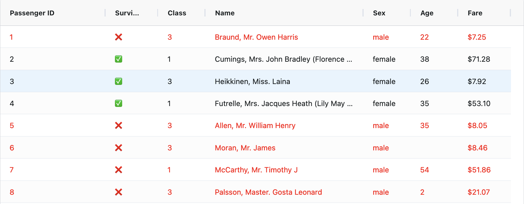
As a result, AG Grid offers the most comprehensive feature set, bringing an Excel-like experience to your web application. While it shares many features with DataTable, it excels in advanced functionality like row grouping, pivoting, and tree data structures.
Important note: AG Grid requires an enterprise license to access its most advanced features, such as pivoting, advanced filtering, and enterprise-ready exporting options. However, the main features are accessible in the free, community version.
import dash
from dash import html
import dash_ag_grid as dag
import pandas as pd

app = dash.Dash(__name__)

# Load Titanic dataset and select subset of columns for clarity
url = "https://raw.githubusercontent.com/datasciencedojo/datasets/master/titanic.csv"
df = pd.read_csv(url)
df = df[['PassengerId', 'Survived', 'Pclass', 'Name', 'Sex', 'Age', 'Fare']]

# Modify columns for better readability
df['Survived'] = df['Survived'].map({0: '❌', 1: '✅'})

columnDefs = [
    {
        'field': 'PassengerId',
        'headerName': 'Passenger ID',
        # Add a checkbox on this column
        'checkboxSelection': True
    },
    {
        'field': 'Survived',
        'width': 100,
    },
    {
        'field': 'Pclass',
        'headerName': 'Class',
        'width': 90
    },
    {
        'field': 'Name',
        'width': 300
    },
    {
        'field': 'Sex',
        'width': 90
    },
    {
        'field': 'Age',
        'width': 90
    },
    {
        'field': 'Fare',
        'width': 100,
        # The formatting requires a JavaScript function to be passed as a string
        'valueFormatter': {'function': 'd3.format("$.2f")(params.value)'}
    },
]

# Create AG Grid component
app.layout = html.Div([
    dag.AgGrid(
        rowData=df.to_dict('records'),
        columnDefs=columnDefs,

        # Enable key features
        defaultColDef={
            'editable': True,
            'resizable': True,
            'sortable': True,
            'filter': True
        },
        dashGridOptions={
            'pagination': True,
            'paginationAutoPageSize': True,
            'animateRows': True,
            'enableRangeSelection': True
        },

        style={"height": "100vh"}  # Take 100% of window height
    )
])

if __name__ == '__main__':
    app.run_server(debug=True)
Try it below (or click here):
As you can see, the AG Grid table comes with a clean, modern user interface and user experience (UI/UX). Editable cells, pagination, filtering, ordering, infinite scrolling are supported out-of-the-box. It also comes with powerful features like row selection, cell pinning, and row dragging. You can even create advanced layouts like row trees or enable dragging rows between tables.
However, advanced layout customization comes at the price of complexity. For example, embedding a button in an AG Grid table is possible but will be a little more complicated than with the Bootstrap option. For instance, AG Grid supports custom components, but implementing them requires knowledge of JavaScript/React.
Note: I could not summerize here all the tabular use cases made possible with AG Grid. I encourage you to visit the extensive Dash AG Grid documentation and examples, it’s really interesting.
Styling with AG Grid
AG Grid is really flexible, but the configuration for styling can take some time compared to the other options. You can apply conditional styling to cells, rows, or columns, and even use custom renderers for advanced visual customizations:
getRowStyle = {
    "styleConditions": [
        {
            "condition": "params.data.Survived === '❌'",
            "style": {"color": "red"},
        },
    ],
}
You will notice the subtle difference: the condition code is now written in JavaScript, not Python. Which makes things a little more complex if you don’t know the very basics of this language.
Why choose AG Grid?
AG Grid is the best choice when you’re building enterprise-level applications or need to replicate desktop spreadsheet functionality in the browser. It’s particularly valuable when your users are coming from Excel backgrounds and expect similar functionality in your web application.
In short, choose AG Grid when you need to provide the best user experience on your data table. But be prepared to spend more time tweaking the parameters of AG Grid.
4. Not recommended approaches
There are two approaches that, while possible, are generally not recommended:
- Using HTML Table Components (
html.Table,html.Td,html.Tr): While this gives you full control over the HTML, you’ll need to implement all functionality from scratch, making it tedious and time-consuming. This is essentially what Dash Bootstrap does under the hood. - Using Plotly Graph Objects Table (
go.Table): This is designed for displaying tables within chart contexts and lacks the flexibility and features of the dedicated table components discussed above.
5. Feature comparison: (bootstrap) Table vs DataTable vs AG Grid
Now that we have reviewed the basic features, let’s summarize them in a detailed table:
| Feature | Bootstrap Table | DataTable | AG Grid |
|---|---|---|---|
| Basic Display | ✅ | ✅ | ✅ |
| Custom Components in Cells | ✅ | ❌ (Markdown only) | ✅ (JS required) |
| Pagination | Manual Implementation | ✅ Built-in | ✅ Built-in |
| Sorting | Manual Implementation | ✅ Built-in | ✅ Built-in |
| Filtering | Manual Implementation | ✅ Built-in | ✅ Built-in |
| Column Resizing | ❌ | ✅ | ✅ |
| Column Reordering | ❌ | ✅ | ✅ |
| Fixed/Frozen Columns | ❌ | ✅ | ✅ |
| Row Selection | Manual Implementation | ✅ | ✅ |
| Cell Editing | Manual Implementation | ✅ | ✅ |
| CSV Export | Manual Implementation | ✅ | ✅ |
| Excel Export | Manual Implementation | ✅ | ⚡ Enterprise Only |
| Row Grouping | ❌ | ❌ | ✅ |
| Pivoting | ❌ | ❌ | ⚡ Enterprise Only |
| Tree Data | Manual Implementation | ❌ | ✅ |
| Virtual Scrolling | ❌ | ✅ | ✅ |
| Backend Pagination | Manual Implementation | ✅ | ✅ |
| Row Dragging | ❌ | ❌ | ✅ |
| Column Spanning | ✅ | ❌ | ✅ |
| Row Spanning | ✅ | ❌ | ✅ |
| Setup Complexity | Simple | Moderate | Complex |
| Performance (Large Data) | Poor | Good | Good |
| Learning Curve | Minimal | Moderate | Steep |
Legend: ✅ Supported out-of-the-box | ❌ Not supported | ⚡ Enterprise feature. ‘Manual Implementation’ means possible but requires custom development
6. Conclusion
We reviewed three ways to turn your CSV/Excel data into a table with Dash Python.

At the end, how to make your choice?
- Choose Bootstrap Table if you need a simple static display for small datasets (< 100 lines). It’s perfect for straightforward displays with minimal setup.
- Choose DataTable when you need built-in interactivity like sorting and filtering for medium-sized datasets. It’s also excellent for editable tables and offers a good balance of features without complexity.
- Choose AG Grid if you need to provide the best user experience on your data table, with Excel-like functionality and advanced styling. But it comes with the need of additional Javascript knowledge.
Opinion. I personally prefer to use Dash Bootstrap for static table displays. For more advanced interactive data display, I prefer AG Grid for its user experience, but achieving what I want to do is often complex.
Remember, you can always start with the simplest solution that meets your needs —many applications work perfectly fine with a basic Bootstrap table, and you can upgrade to more advanced components as your requirements grow.
I hope this article helped you to grasp the differences between the table providers! ⭐
Feel free to join the discussion or ask question on the associated topic here.