The Dash DataTable is a powerful component to display tabular data. However, I’ve always felt it didn’t seamlessly integrate with the applications I was developing.
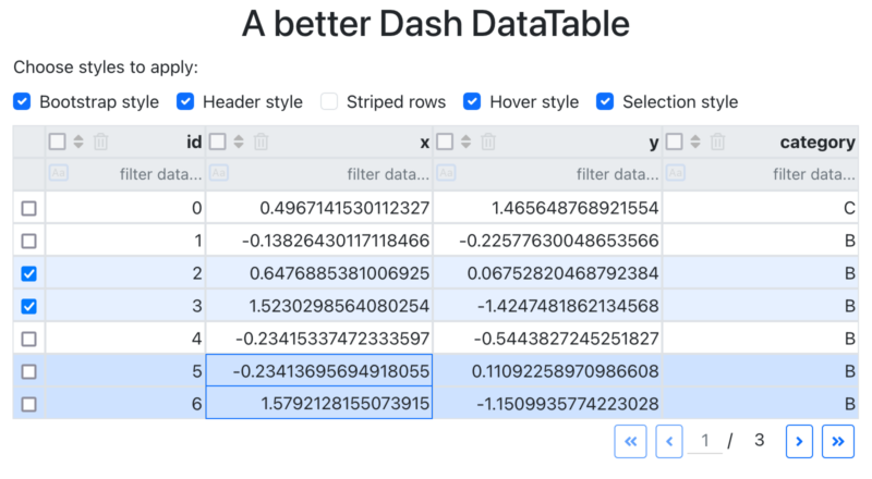
In this article, I’ll show you how you can improve the user interface and user experience (UI/UX) of a DataTable by tweaking some parts using CSS (⬇️ interactive app below ⬇️)
Let’s dive in!
1 – Add Bootstrap styles
First things first: the DataTable’s basic styles don’t integrate well with an app. The main reason is that many styles, such as the font-family, are hardcoded.
If you work with Dash Bootstrap Components, this becomes obvious. Let’s take a simple app as an example:
import pandas as pd
import numpy as np
import dash_bootstrap_components as dbc
from dash import Dash, html, Input, Output, dash_table

# Create sample data
np.random.seed(42)
size = 20
df = pd.DataFrame({
    "id": range(size),
    "x": np.random.normal(0, 1, size),
    "y": np.random.normal(0, 1, size),
    "category": np.random.choice(["A", "B", "C"], size)
})

# Initialize the Dash app
app = Dash(__name__, external_stylesheets=[dbc.themes.BOOTSTRAP])

# Define the layout
app.layout = html.Div(
    [
        # Data table
        html.Div(
            dash_table.DataTable(
                id="table",
                columns=[
                    {"name": i, "id": i, "deletable": True, "selectable": True} for i in df.columns
                ],
                data=df.to_dict("records"),

                # Enable multi-row selection and paging
                filter_action="native",
                sort_action="native",
                sort_mode="multi",
                column_selectable="multi",
                row_selectable="multi",
                page_action="native",
                page_size=10,
            ),
            id="table_container",
        )
    ],
    className="container"
)

# Run the app
if __name__ == '__main__':
    app.run_server(debug=True)
The solution is to overwrite the DataTable’s styles with Bootstrap styles. Fortunately, Ann Marie Ward, a major Dash contributor, has already created a solution for this here ( thank you Ann if you see this 🙏).
Her CSS stylesheet includes styles to apply Bootstrap themes to Dash components, such as tables and buttons, for a consistent appearance. We’ll download it (link), and save into into the assets folder at assets/dbc.css.
Then, we just need to add the dbc CSS class to a container div wrapping our DataTable:
# Data table
html.Div(
    dash_table.DataTable(
        # ...
    ),
    id="table_container",
    className="dbc"  # we added the dbc class
)
As you can see, the table now inherits the Bootstrap styles. However, the pagination remains untouched.
Unfortunately, there is no option to dynamically set the className of the buttons to Bootstrap’s btn, btn-outline-primary, and btn-sm. But we can copy their styles (e.g., from the Bootstrap documentation) and apply them to the four pagination buttons (.first-page, .next-page, .previous-page, .last-page):
/* reset font styles on pagination buttons */
.dbc .dash-table-container .previous-next-container .page-number,
.dbc .dash-table-container .previous-next-container .page-number .current-page-container input.current-page {
    font-family: var(--bs-body-font-family);
    font-size: var(--bs-body-font-size);
    font-weight: var(--bs-body-font-weight);
    line-height: var(--bs-body-line-height);
    min-width: auto !important;
}

/* apply the same styles as .btn, .btn-sm, .btn-outline-primary */
.dbc .dash-table-container .previous-next-container {
    button {
        &.first-page,
        &.last-page,
        &.previous-page,
        &.next-page {
            display: inline-block;
            font-weight: 400;
            text-align: center;
            vertical-align: middle;
            user-select: none;
            padding: 0.25rem 0.5rem;
            margin: 0 0.25rem;
            font-size: 0.875rem;
            line-height: 1.5;
            border-radius: 0.2rem;
            transition: color 0.15s ease-in-out, background-color 0.15s ease-in-out, border-color 0.15s ease-in-out, box-shadow 0.15s ease-in-out;
            color: var(--bs-primary);
            border: 1px solid var(--bs-primary);
            background-color: transparent;

            &:hover {
                color: var(--bs-white) !important; /* override dbc.css */
                background-color: var(--bs-primary);
                border-color: var(--bs-primary);
            }

            &:focus {
                box-shadow: 0 0 0 0.25rem var(--bs-primary-rgb, rgba(13, 110, 253, 0.25));
            }

            &:active,
            &.active {
                color: var(--bs-white);
                background-color: var(--bs-primary);
                border-color: var(--bs-primary);
            }

            &:disabled,
            &.disabled {
                color: var(--bs-primary);
                background-color: transparent;
                border-color: var(--bs-primary);
                opacity: 0.65;
                pointer-events: none;
            }
        }
    }
}
CSS rules are applied by order of importance (priority) to an element. The more you add precision to the selection, the more weight the rule has:
/* a rule targetting a button */
.dash-table-container button { ... }
/* equivalent, but more precise (more weight): */
body .dash-table-container .previous-next-container button {...}
That’s why sometimes we see a long selector definition, and sometimes not —because in some cases, it’s too complex to increase the weight of a rule. Then !important keyword enable us to override some CSS properties without having to make a stronger rules.
Good to know: It’s better to avoid !important whenever possible because each use makes future overrides more complex. Imagine if the creators of Bootstrap had used !important everywhere—overriding their styles would have been a nightmare!
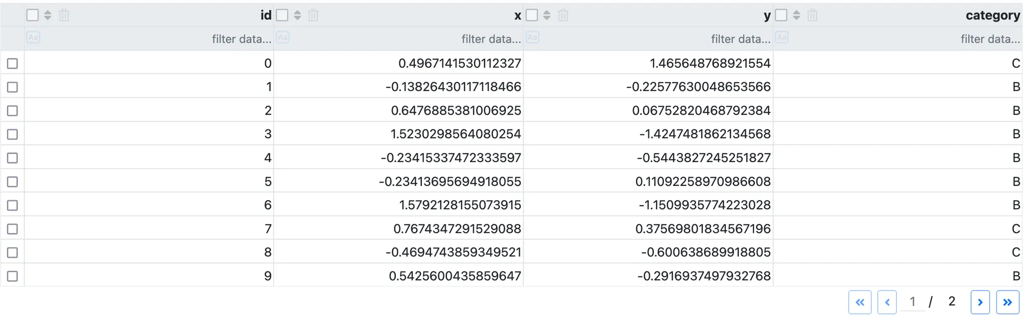
Now let’s visualize the result:
We now have a Bootstrap-styled DataTable. Much better!
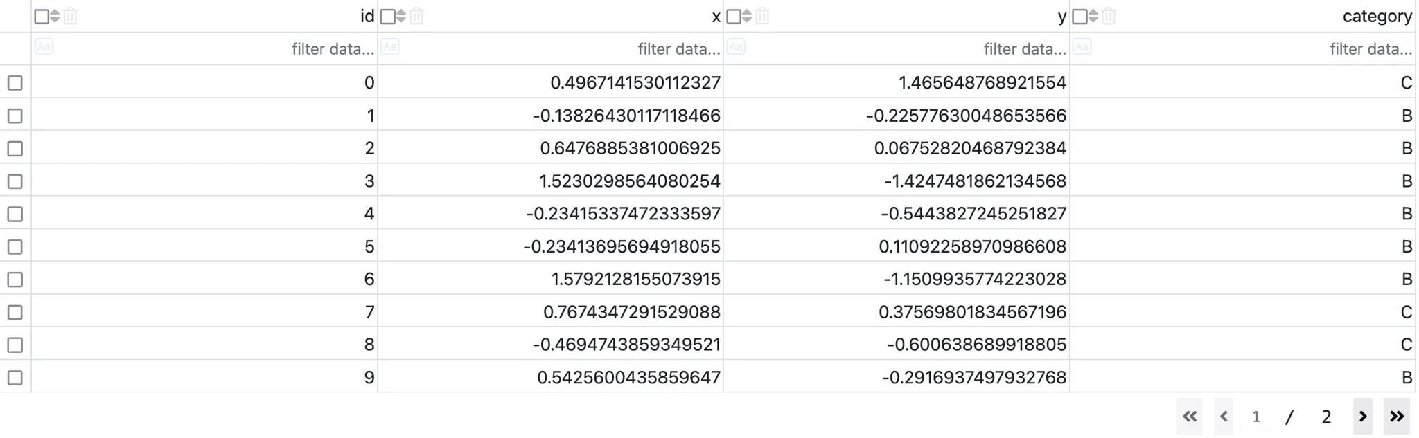
2 – Improve the header
There are a few things I don’t like about the default DataTable header, but thankfully, everything is fixable with CSS.
First, the header row should be highlighted:
/* make the heading bold and with a gray background */
.header-style .dash-table-container th {
    background-color: var(--bs-gray-200) !important;
}

.header-style .dash-table-container th .column-header-name {
    font-weight: bold;
}

.header-style .dash-table-container th input::placeholder {
    /* overrides back a style set in dbc.css */
    background-color: transparent !important;
}
If you are not familiar with CSS variables, take a look at this documentation. They allow using the Bootstrap without hardcoding them. It is useful for themes like dark/light themes that will only require a change of variable value.
Second, the icons in the header are not uniformly sized, vertically aligned, or evenly spaced. Let’s fix that:
/* better homogeneous styling of buttons */
.header-style .column-actions {
    /* let us breath! */
    gap: 0.4em;
    margin-right: 0.5em;
}

.header-style .column-actions > span {
    /* align components vertically */
    display: flex;
    flex-direction: column;
    justify-content: center;
}

.header-style .dash-table-container th input[type="radio"],
.header-style .dash-table-container th input[type="checkbox"] {
		/* fix inconsistent color and size */
    width: 1rem;
    height: 1rem;
    opacity: 0.6;
}

.header-style .dash-table-container th input[type="radio"]:checked,
.header-style .dash-table-container th input[type="checkbox"]:checked {
		/* when checked, reset opacity */
    opacity: 1;
}
Finally, clicking on the case-sensitive filter (aA) causes the column width to change. Adding a transparent border of the same size resolves this issue:
.header-style .dash-table-container .dash-spreadsheet-container .dash-spreadsheet-inner th.dash-filter input.dash-filter--case--insensitive {
    /* avoid column width size change when clicking */
    border-style: solid;
    border-width: 2px;
    border-color: transparent;
}
Remember the CSS weights for rules? The definition above is long on purpose: thanks to this, I don’t need to add !important.
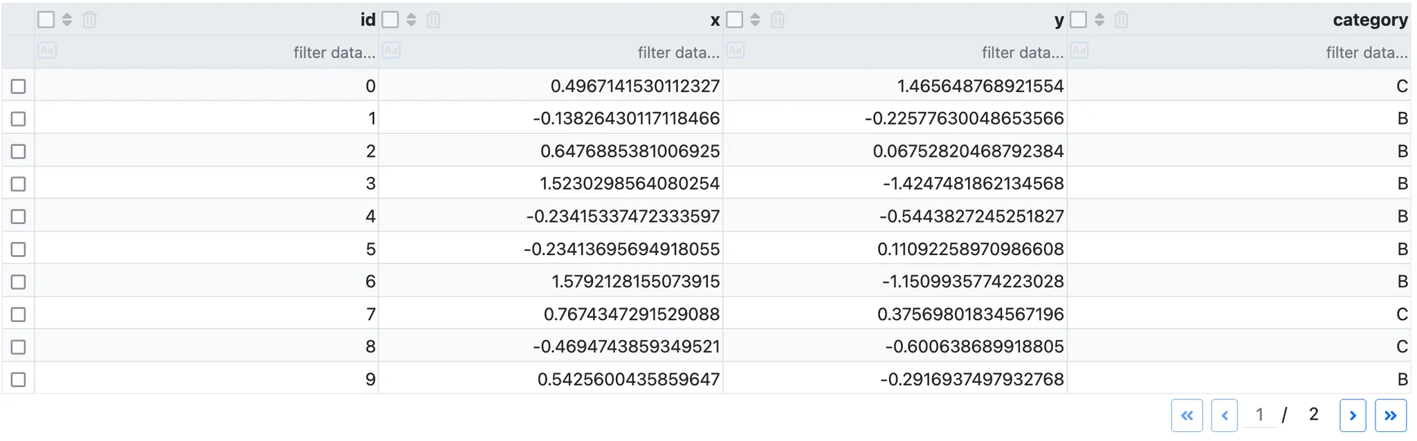
Here is the result:
At this point, there are two types of people: those who notice the differences and those who don’t. If you don’t, I don’t blame you—you live in a much simpler world than I do!
If you do notice the differences, you may experience the satisfaction of seeing these buttons properly arranged. 🙂
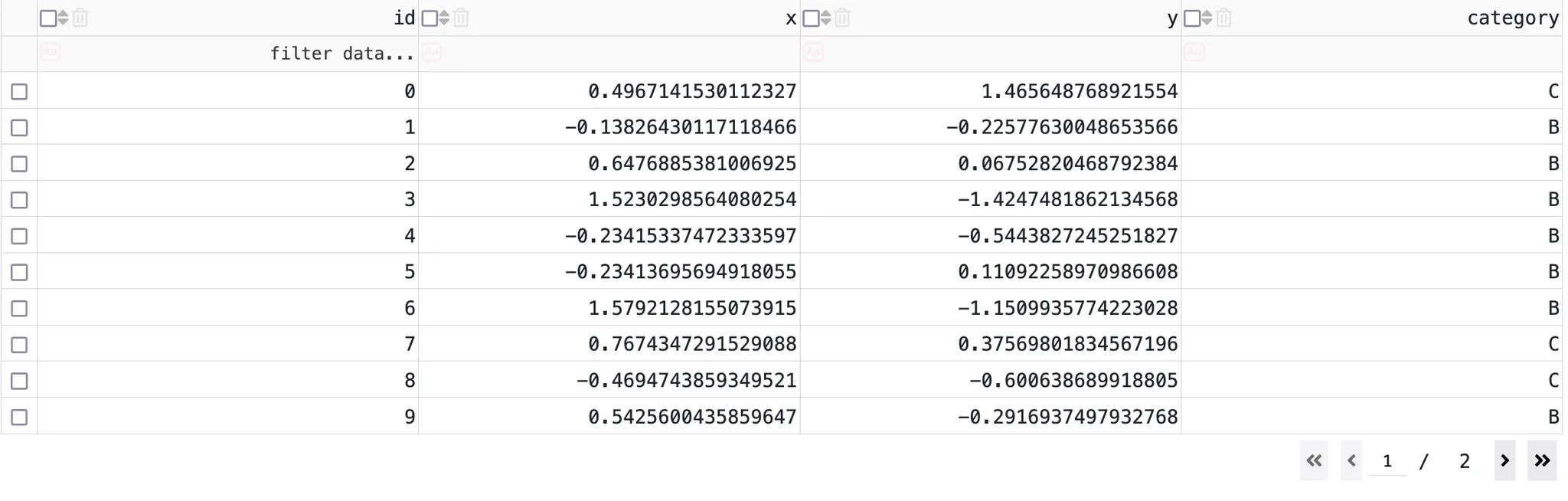
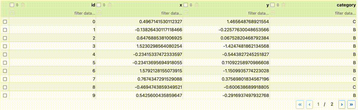
3 – Striped rows
Displaying striped rows can make the table easier on the eyes. It’s a tiny detail, but combined with other enhancements (like mouseover color), it improves the overall user experience of your app.
Striped rows for the DataTable can be achieved in Python, but a simple CSS snippet will also do the job:
/* Alternating row background */
.striped-style .dash-table-container td:not(.cell--selected) {
    background-color: transparent !important;
}

.striped-style .dash-table-container tr:nth-child(odd) {
    background-color: var(--bs-gray-100) !important;
}

.striped-style .dash-table-container tr:nth-child(even) {
    background-color: var(--bs-body-bg) !important;
}
The CSS property :nth-child is the key here, as it allow selecting either odd or even rows tr. The cells td are made transparent as the background is changed at the row level.
4 – Hover effect
Adding a hover effect is a simple trick to enhance interactivity, even for static tables. It implicitly signals to the user that the table is interactive.
Here’s the CSS to add a hover effect:
/* Hover row background */
.hover-style .dash-table-container tr:hover td:not(.cell--selected)  {
    background-color: var(--bs-gray-200) !important;
}
The background is applied to all cells expect selected cells (i.e., active cells), using td:not(.cell—selected).
The hover color is slightly darker (—bs-gray-200 instead of —bs-gray-100) to remain visible even on striped rows.
5 – Row selection
By default, clicking on a cell highlights it. However, in most cases, it’s more intuitive to highlight the entire row. It is also helpful to emphasize rows selected via the left checkboxes. Let’s address this.
This code is slightly more complex:
- We style rows that have the
.cell--selectedclass. This includes rows selected via checkboxes or mouse clicks. - To avoid overlapping borders, we use the adjacent sibling selector (
+) to remove duplicate borders. For example, instead of|X||X|, we get|X|X|.
/* apply style to selected cell */
.selection-style .dash-table-container tr:has(td.cell--selected) td.cell--selected {
    background-color: rgba(var(--bs-primary-rgb), 0.2) !important;
    border: 1px solid var(--bs-primary) !important;
    outline: none !important;
}

/* apply styles to the other cells of selected rows */
.selection-style .dash-table-container tr:has(td.cell--selected) td {
    background-color: rgba(var(--bs-primary-rgb), 0.2) !important;
    border: 1px solid #d0d0d0 !important;
}

/* remove border between selected cells (vertically) */
.selection-style .dash-table-container tr:has(td.cell--selected) + tr:has(td.cell--selected) td.cell--selected {
    background-color: rgba(var(--bs-primary-rgb), 0.2) !important;
    border-top: none !important;
}

/* remove border between selected cells (horizontally) */
.selection-style .dash-table-container tr:has(td.cell--selected) td.cell--selected + td.cell--selected {
    border-left: none !important;
}

/* apply style to checked rows */
.selection-style .dash-table-container tr:has(input:checked) td {
    background-color: rgba(var(--bs-primary-rgb), 0.1) !important;
    border: 1px solid #d0d0d0 !important;
}
Most styles here use !important to remain compatible with the dbc.css styles. If we don’t keep the dbc.css styles, additional lines would be required for proper functionality:
/* add dbc styles to selection-style */
body .selection-style .dash-table-container .dash-spreadsheet-container .dash-spreadsheet-inner td {
    background-color: var(--bs-body-bg);
    color: var(--bs-body-color);
    border: var(--bs-border-width) solid var(--bs-border-color) !important;
}
.selection-style .dash-table-container .dash-spreadsheet-container .dash-spreadsheet-inner table {
    border-collapse: inherit;
    border-spacing: unset;
}
The selection works for rows selected via checkboxes, single mouse clicks, and multiple selections (holding Shift).
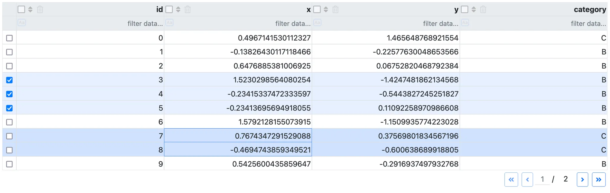
Notice that row selection do not work well visually with striped rows, so I removed it from the above screenshot. Feel free to try it yourself with the interactive app!
How to modify styles yourself
You might wonder how I came up with these precise CSS rules while reading this article.
Overriding CSS styles involves trial and error. Essentially, you need to use developer tools to inspect the applied rules on the target element and figure out how to “override” those rules.
Here’s how you can do it :
- Right click in the browser on the element > Inspect
- Select the element in the browser in the list if necessary
- Look at the CSS styles applied to this element.
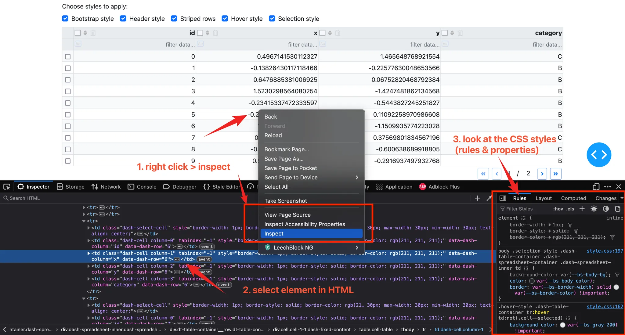
CSS rules are applied in order of priority. Inline styles (applied directly to the element) usually take precedence. Overridden styles are shown as struck-through in developer tools, indicating which rule has the highest priority.
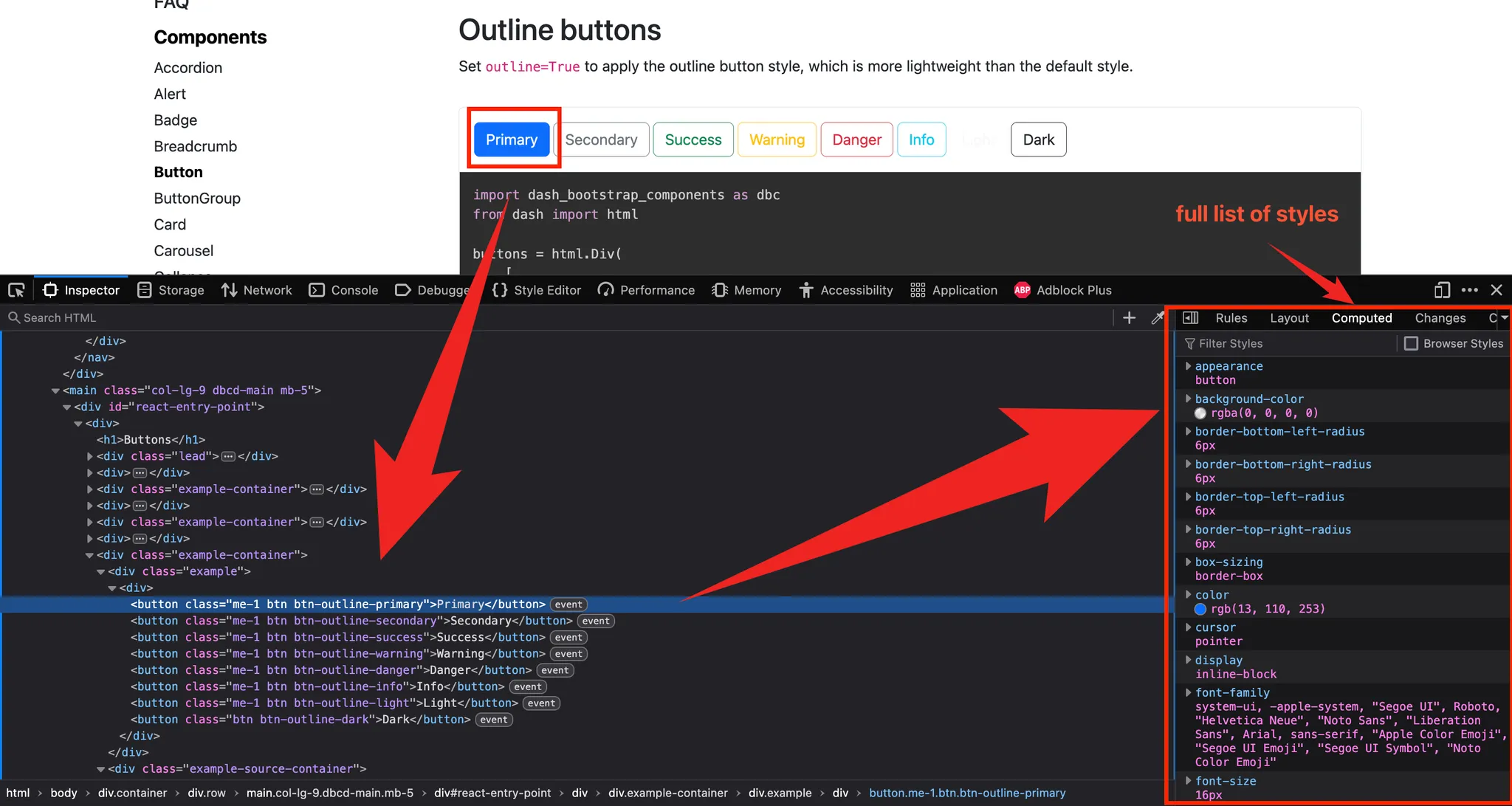
You can also use developer tools to copy styles from another source (as I did for Bootstrap):
If you want to know more about this debugging process, please send an article request.
How to reuse this code
Each part of the styling corresponds to a specific class. This means you can copy and paste the code and simply add the relevant class name: dbc(for the Bootstrap style), header-style, striped-style, hover-style and selection-style.
Example with all styles except striped rows:
# Data table
html.Div(
    dash_table.DataTable(
        # ...
    ),
    id="table_container",
    className="dbc header-style hover-style selection-style" # all styles except striped rows
)
You can also play with the interactive app below to see the differences (or click here):
Click here to see the final CSS code ⬇️
/* Author: Fran from dash-resources.com
 * Originally posted in: https://dash-resources.com/improving-dash-datatables-simple-css-tweaks/
 */

/* ------------------------------------------------*/
/* Bootstrap style */

/* reset font styles on pagination buttons */
.dbc .dash-table-container .previous-next-container .page-number,
.dbc .dash-table-container .previous-next-container .page-number .current-page-container input.current-page {
    font-family: var(--bs-body-font-family);
    font-size: var(--bs-body-font-size);
    font-weight: var(--bs-body-font-weight);
    line-height: var(--bs-body-line-height);
    min-width: auto !important;
}

/* apply the same styles as .btn, .btn-sm, .btn-outline-primary */
.dbc .dash-table-container .previous-next-container {
    button {
        &.first-page,
        &.last-page,
        &.previous-page,
        &.next-page {
            display: inline-block;
            font-weight: 400;
            text-align: center;
            vertical-align: middle;
            user-select: none;
            padding: 0.25rem 0.5rem;
            margin: 0 0.25rem;
            font-size: 0.875rem;
            line-height: 1.5;
            border-radius: 0.2rem;
            transition: color 0.15s ease-in-out, background-color 0.15s ease-in-out, border-color 0.15s ease-in-out, box-shadow 0.15s ease-in-out;
            color: var(--bs-primary);
            border: 1px solid var(--bs-primary);
            background-color: transparent;

            &:hover {
                color: var(--bs-white) !important; /* override dbc.css */
                background-color: var(--bs-primary);
                border-color: var(--bs-primary);
            }

            &:focus {
                box-shadow: 0 0 0 0.25rem var(--bs-primary-rgb, rgba(13, 110, 253, 0.25));
            }

            &:active,
            &.active {
                color: var(--bs-white);
                background-color: var(--bs-primary);
                border-color: var(--bs-primary);
            }

            &:disabled,
            &.disabled {
                color: var(--bs-primary);
                background-color: transparent;
                border-color: var(--bs-primary);
                opacity: 0.65;
                pointer-events: none;
            }
        }
    }
}

/* ------------------------------------------------*/
/* Header style
 * Notice we use !important to override the default style and those written in the dbc.css file
 */

/* make the heading bold and with a gray background */
.header-style .dash-table-container th {
    background-color: var(--bs-gray-200) !important;
}

.header-style .dash-table-container th .column-header-name {
    font-weight: bold;
}

.header-style .dash-table-container th input::placeholder {
    /* overrides back a style set in dbc.css */
    background-color: transparent !important;
}

/* better homogeneous styling of buttons */
.header-style .column-actions {
    /* let us breath! */
    gap: 0.4em;
    margin-right: 0.5em;
}

.header-style .column-actions > span {
    /* align components vertically */
    display: flex;
    flex-direction: column;
    justify-content: center;
}

.header-style .dash-table-container th input[type="radio"],
.header-style .dash-table-container th input[type="checkbox"] {
    /* fix inconsistent color and size */
    width: 1rem;
    height: 1rem;
    opacity: 0.6;
}

.header-style .dash-table-container th input[type="radio"]:checked,
.header-style .dash-table-container th input[type="checkbox"]:checked {
        /* when checked, reset opacity */
    opacity: 1;
}

.header-style .dash-table-container .dash-spreadsheet-container .dash-spreadsheet-inner th.dash-filter input.dash-filter--case--insensitive {
    /* avoid column width size change when clicking */
    border-style: solid;
    border-width: 2px;
    border-color: transparent;
}

/* ------------------------------------------------*/
/* Alternating row background */
.striped-style .dash-table-container td:not(.cell--selected) {
    background-color: transparent !important;
}

.striped-style .dash-table-container tr:nth-child(odd) {
    background-color: var(--bs-gray-100) !important;
}

.striped-style .dash-table-container tr:nth-child(even) {
    background-color: var(--bs-body-bg) !important;
}

/* ------------------------------------------------*/
/* Hover row background */
.hover-style .dash-table-container tr:hover td:not(.cell--selected)  {
    background-color: var(--bs-gray-200) !important;
}

/* ------------------------------------------------*/
/* Selected row style */

/* apply style to selected cell */
.selection-style .dash-table-container tr:has(td.cell--selected) td.cell--selected {
    background-color: rgba(var(--bs-primary-rgb), 0.2) !important;
    border: 1px solid var(--bs-primary) !important;
    outline: none !important;
}

/* apply styles to the other cells of selected rows */
.selection-style .dash-table-container tr:has(td.cell--selected) td {
    background-color: rgba(var(--bs-primary-rgb), 0.2) !important;
    border: 1px solid #d0d0d0 !important;
}

/* remove border between selected cells (vertically) */
.selection-style .dash-table-container tr:has(td.cell--selected) + tr:has(td.cell--selected) td.cell--selected {
    background-color: rgba(var(--bs-primary-rgb), 0.2) !important;
    border-top: none !important;
}

/* remove border between selected cells (horizontally) */
.selection-style .dash-table-container tr:has(td.cell--selected) td.cell--selected + td.cell--selected {
    border-left: none !important;
}

/* apply style to checked rows */
.selection-style .dash-table-container tr:has(input:checked) td {
    background-color: rgba(var(--bs-primary-rgb), 0.1) !important;
    border: 1px solid #d0d0d0 !important;
}

/* add dbc styles to selection-style */
body .selection-style .dash-table-container .dash-spreadsheet-container .dash-spreadsheet-inner td {
    background-color: var(--bs-body-bg);
    color: var(--bs-body-color);
    border: var(--bs-border-width) solid var(--bs-border-color) !important;
}
.selection-style .dash-table-container .dash-spreadsheet-container .dash-spreadsheet-inner table {
    border-collapse: inherit;
    border-spacing: unset;
}
Conclusion
I hope this article showed how far you can go with CSS to override predefined styles. Even though it’s not perfect, small enhancements like these can significantly improve the user interface and user experience of your dashboard or app.
Feel free to contact me if you have suggestions for this code. Don’t forget to subscribe to get notified about new articles!
Happy Dash coding ⭐